National Women’s Soccer League

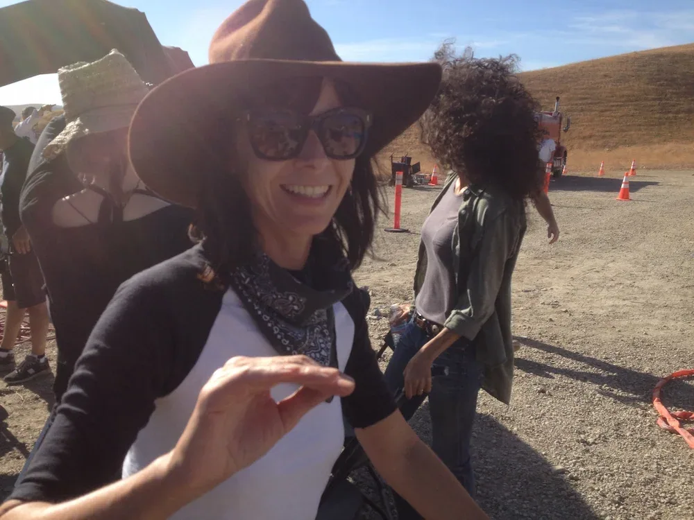
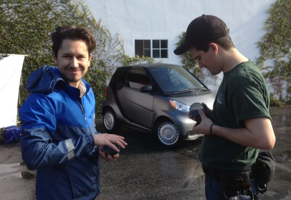
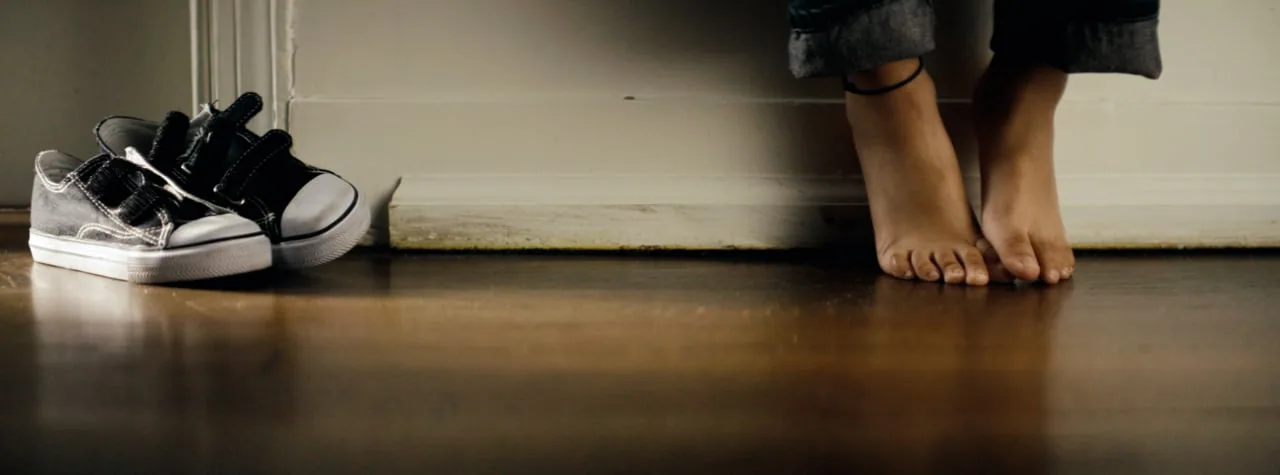
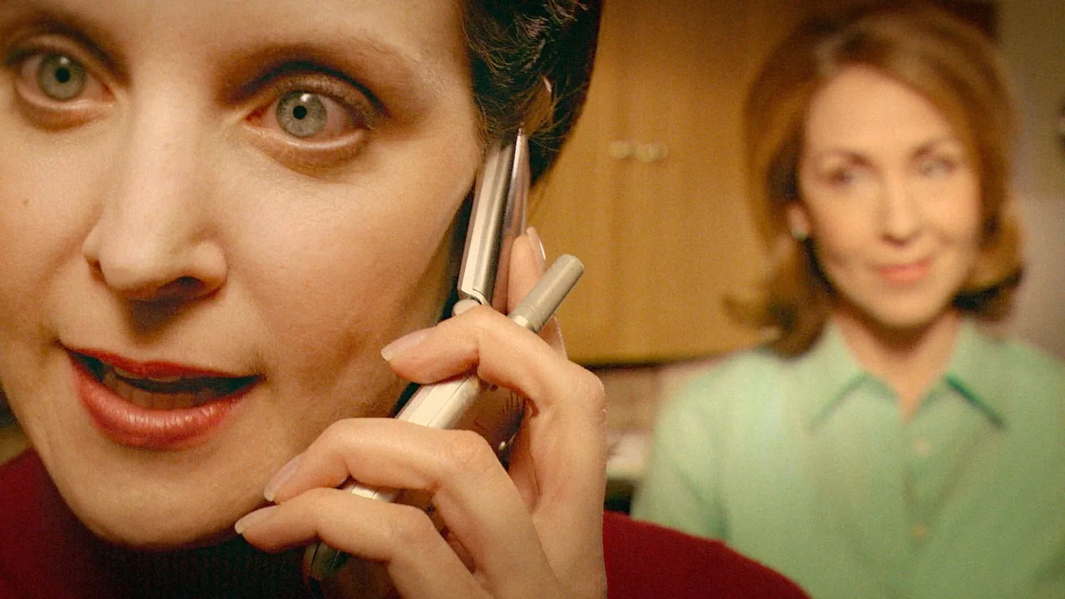
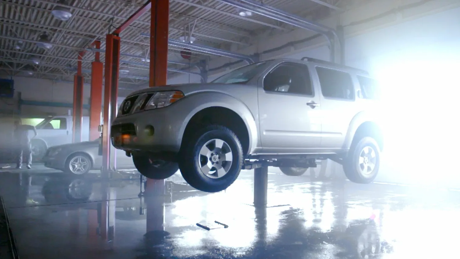
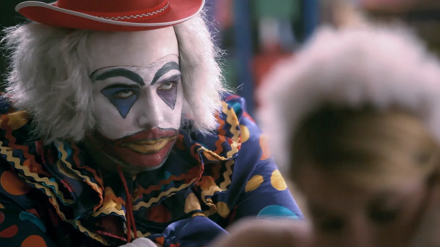
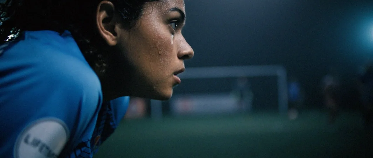
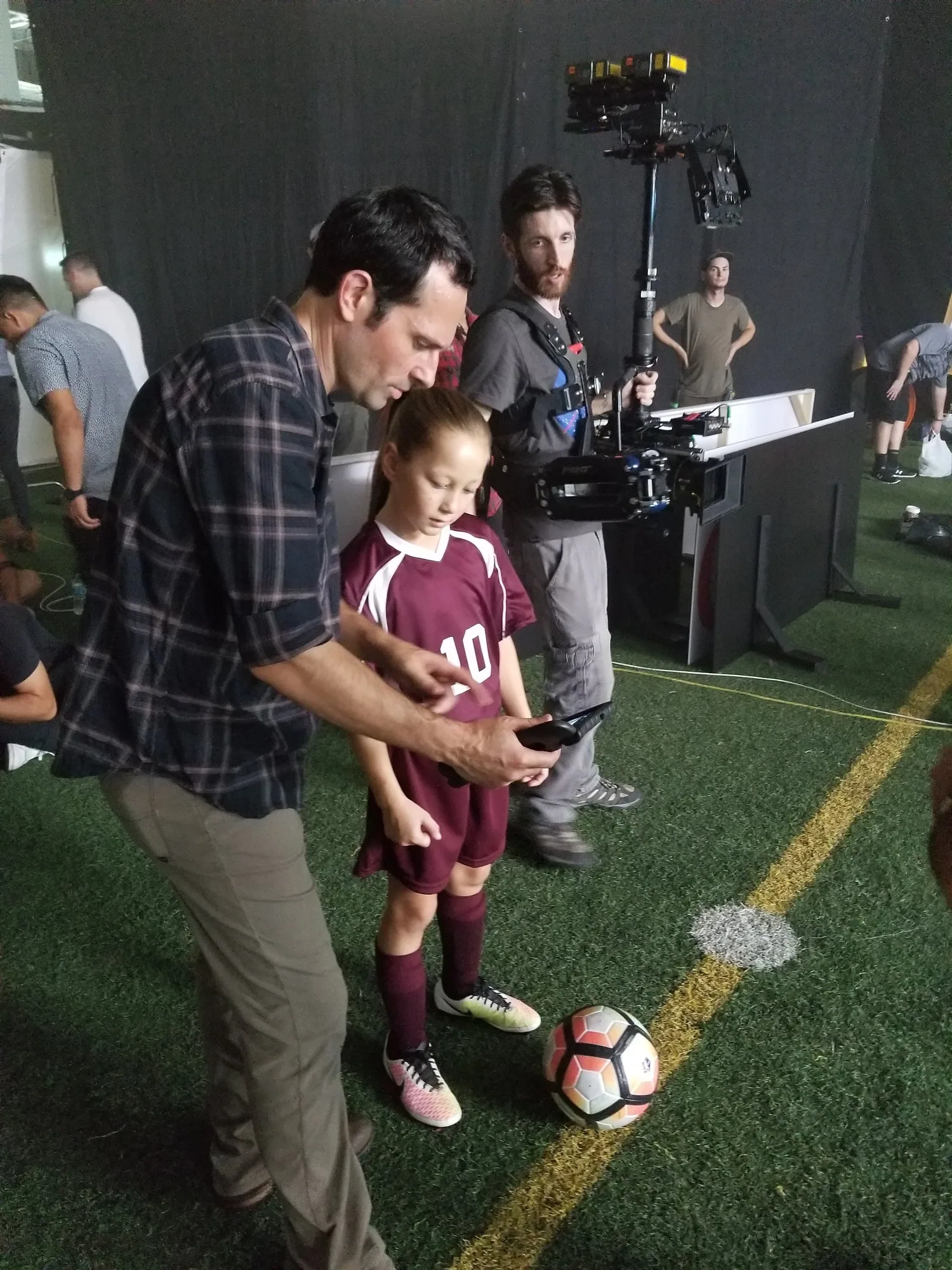
Proud to share the director’s cut of a project I shot with Lara Wickes at Canyon Road Films for the National Women’s Soccer League on Lifetime. Working with professional athletes is always humbling and inspiring and these women managed to also make it fun with their playful energy and “can do” spirit.
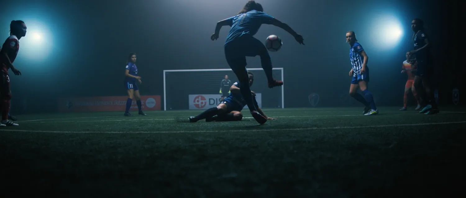
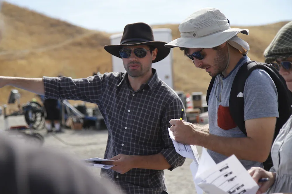
As is often the case with athletes, we had them for only a brief window but our crack team, led by cinematographers Jeff Bierman and Martim Vian, production designer Brooke Ashe, and assistant director Jim Simone, somehow made it work.
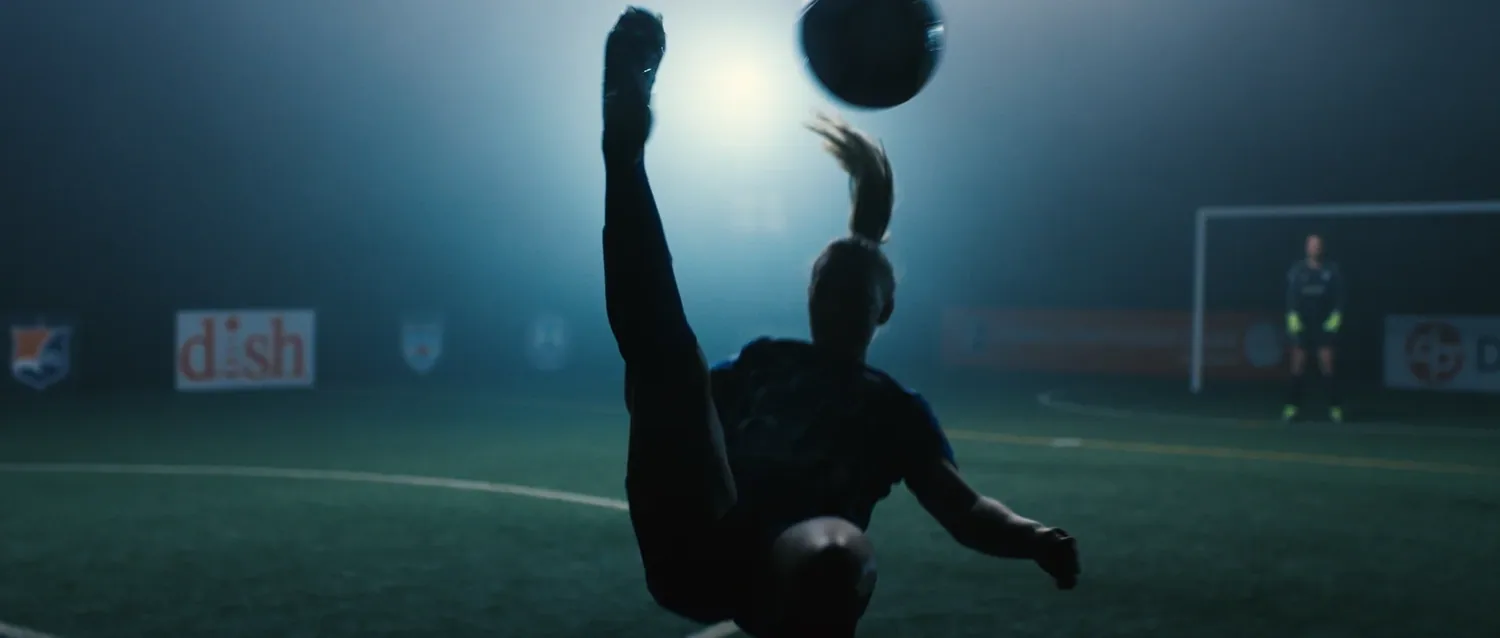
This immersive fantasy-reality blend started as a seed in my head but wouldn’t have - couldn’t have - flowered without the creative ingenuity and relentless experimentation of editor Jai Shukla from Nomad Editorial.
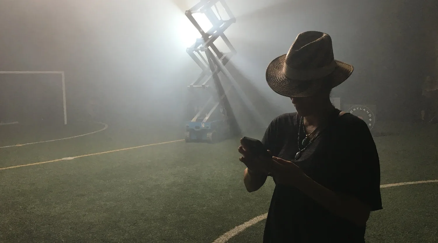
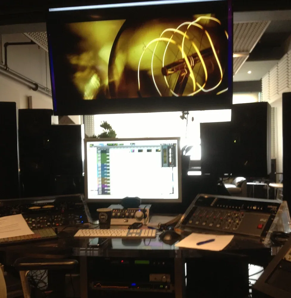
Knowing the soundscape would be an integral character, I was fortunate to collaborate with Dominick Michele at Digital Arts who helped create our heroine’s epic imagination.

Finally, helping to distinguish these perspectives, Lenny Mastrandrea over at Nice Shoes gave each a distinctly stylized color palette to complete our story of a young girl envisioning her future.

Many thanks to the entire team...
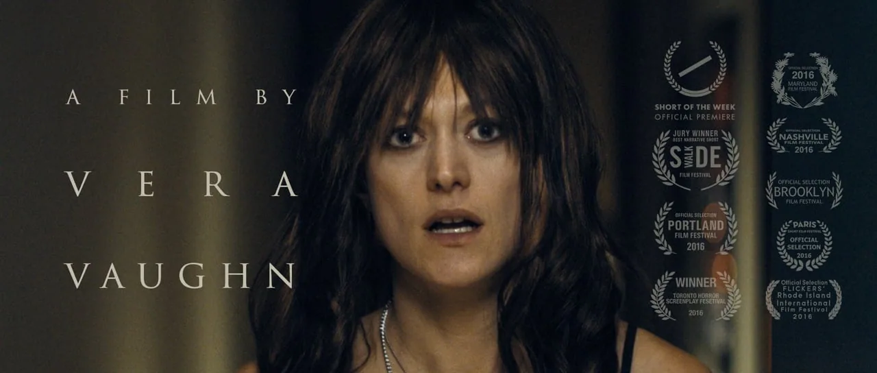
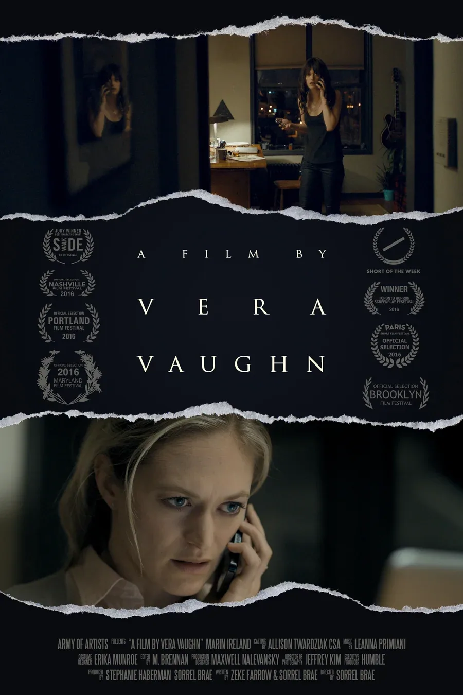
A Film by Vera Vaughn

Over a year ago, manically talented screenwriter Zeke Farrow and I began developing a puzzling, film-in-film psychological thriller about identity and obsession in the digital age. As the feature script evolved, it became clear we needed to test our premise. When it was time to shoot, would I really be able to create gripping suspense and compelling mystery with just an actress, an apartment, and a computer screen inside a logic-defying world?

I set out to answer that question with a short meta-film: A FILM BY VERA VAUGHN. Written specifically for the short format with an M.C. Escher-like circularity and inspired by the early work of Roman Polanski, I assembled my dream team and got to work.

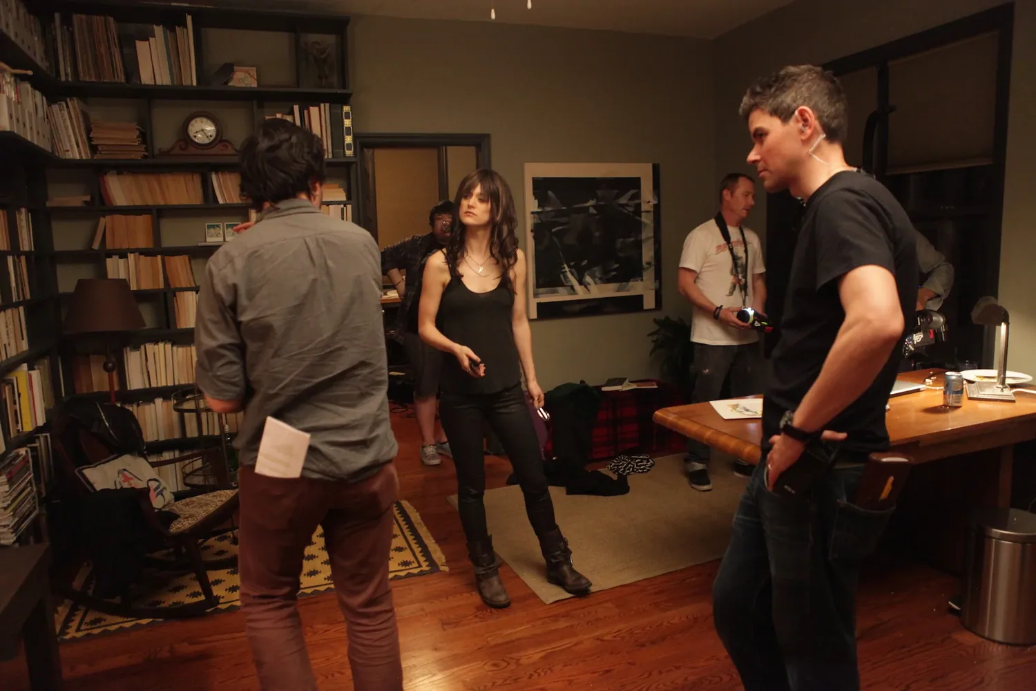
With my usual partners-in-crime on board — producer Stephanie Haberman, cinematographer Jeffrey Kim, editor M. Brennan, and costume designer Erika Munro — I knew our craft would be solid. But with such an intricate script focusing on two women played by the same actress, the whole thing hinged on the performance. We needed someone with serious chops.

Working with casting directors Allison Twardziak and Jodi Kipperman, we found her. Known as much for her work in film and television as for her virtuoso stage performances, Marin Ireland put on a master class of sharp precision and delicate vulnerability that had our entire crew spellbound, take after take.

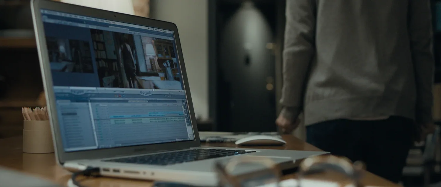
After three grueling nights (and the very real threat of eviction), it was time to begin the edit. Because of the technical complexity of the screen-in-screen scenes (all of Vera’s shots are horizontally flipped to create subconscious discomfort), editor M. Brennan and assistant editor Jay McConville had prepared extensive pre-cuts of select sequences. Slotting these together worked seamlessly but the art of it lay ahead. Four months ahead, to be precise, as M. Brennan and I tweaked the cut’s pacing to hit the heights of tension without losing our audience’s interest.

The creative contribution of three special artists carried us across that finish line. The creepy but hypnotic score of Leanna Primiani, the exquisitely detailed audio engineering of Joseph Miuccio of Pure Sound, and the subtly enriched color grade of Mike Howell from Color Collective.

We’ve been honored to have the film premiere at the Nashville Film Festival and go on to play the Maryland, Brooklyn, Portland, and Paris Film Festivals as well as win the Jury Prize for Best Narrative Short at the Sidewalk Film Festival. Our online premiere through Short of the Week has been another great privilege as was receiving a Vimeo Staff Pick. We’re all looking forward to bringing the feature version of this odd story to a theater near you.

Finally, I’m immensely proud of, and deeply grateful for, the top-level work our crew put into this film. It simply would not exist without their incredible contributions which is why the film begins like this:

The Rockettes

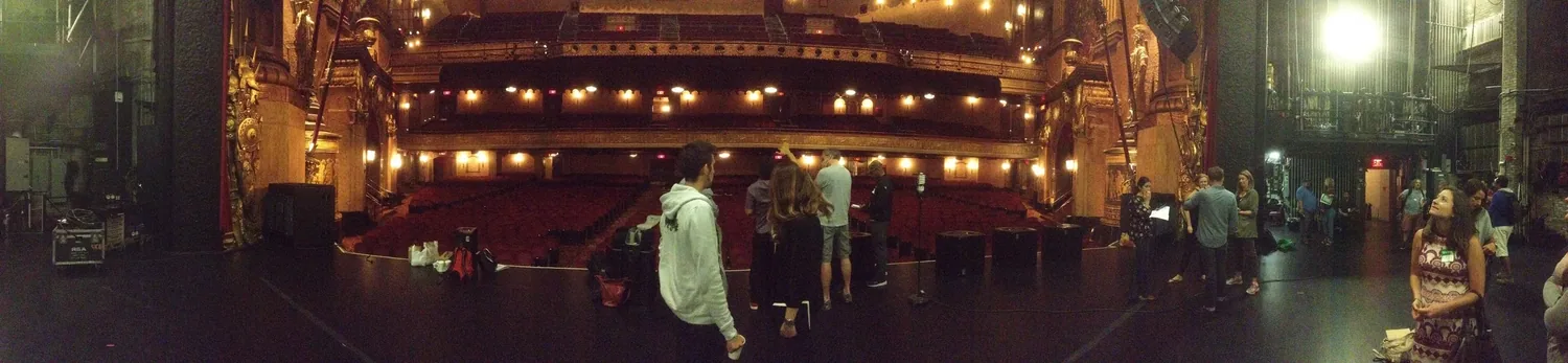
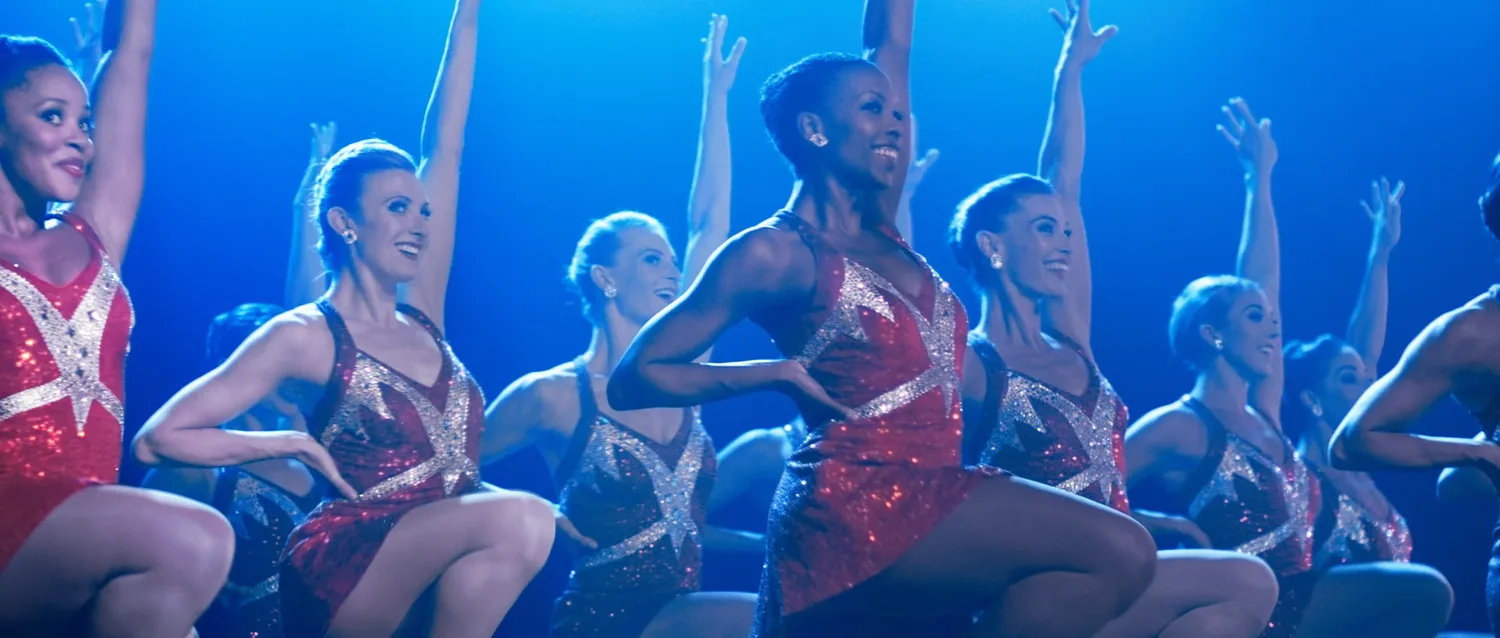
Some shows are lucky enough to become institutions. The Rockettes are one of them.

Last month I had the pleasure of working with these icons of the New York stage on their Christmas campaign.

Collaborating with the excellent and friendly team from the Martin Agency (James Robinson, Lassiter Stone, Brooke England, Colleen Hopkins, Kelly Sutton), we labored to capture genuinely joyous reactions to a “surprise” appearance by the real Rockettes.

As satisfying as these undirected reactions were, the big treat was working with the Rockettes themselves. I left the shoot awed by their physical prowess and rigorous precision. These dancers are no less than professional athletes performing in micro-second synchronicity. Truly stunning. Thank you for letting our motley film crew step into your world. 

As always, thanks to my excellent team, including the consistently breathtaking photography of DoP Jeffrey Kim, the organizational management of producer Stephanie Haberman, the morale boost of AD Arle Bordas, the fine cutting chops of editor Eric Wais and the musical genius of James Morgan.

We DID Start the Fire

Socialist leanings can make for awkward conversation among hyper-Capitalist advertisers.  Which is why creating a film for Firefox to celebrate their 10-year anniversary as an open-source, non-profit dedicated to a free and open internet was so personally refreshing.

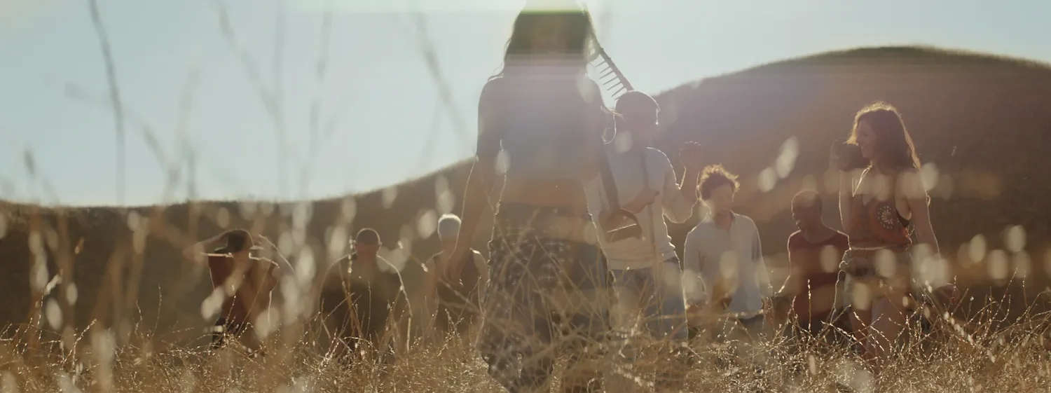
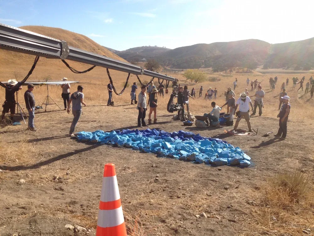
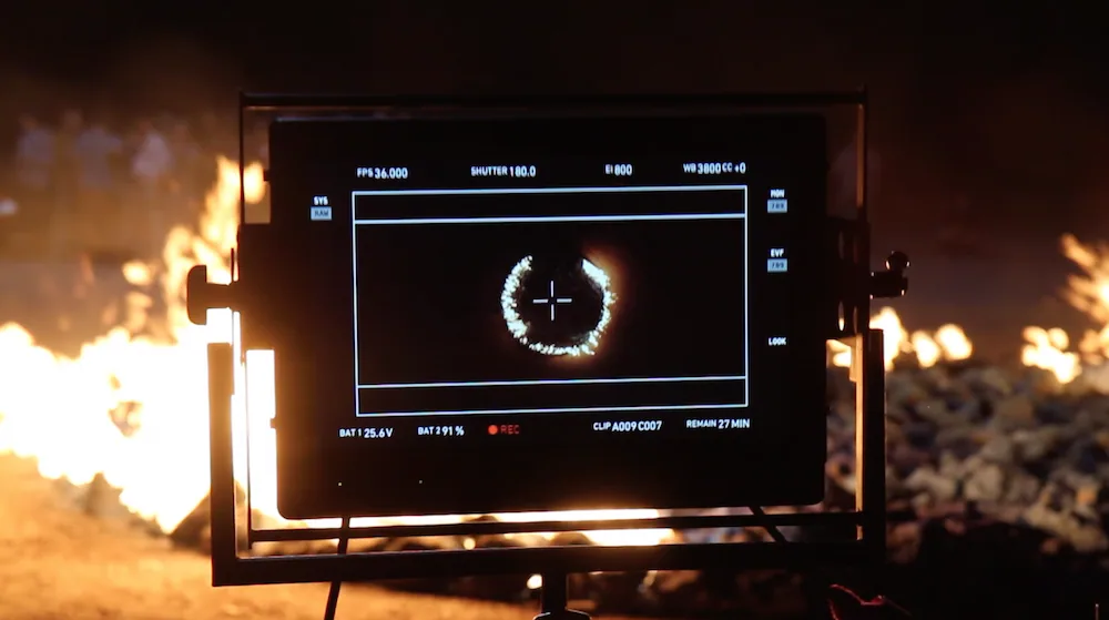
From the beginning with the Firefox team and Occam’s David Lipson, we envisioned a metaphoric world of cooperation based on the construction of a fire sculpture larger than any one person could make alone.

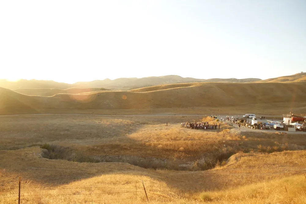
Mirroring that story, our community of artists and producers and makers and doers joined together to pull off an incredible, and incredibly fun, shoot.

Producer Anne Johnson overcame seemingly impossible obstacles on a daily basis.

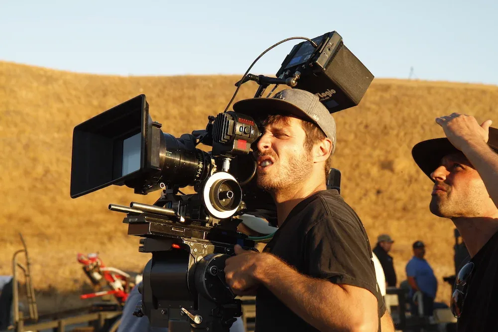
While DoP Alex Disenhof leapt into pre-pro with an energy and enthusiasm that the project really needed.

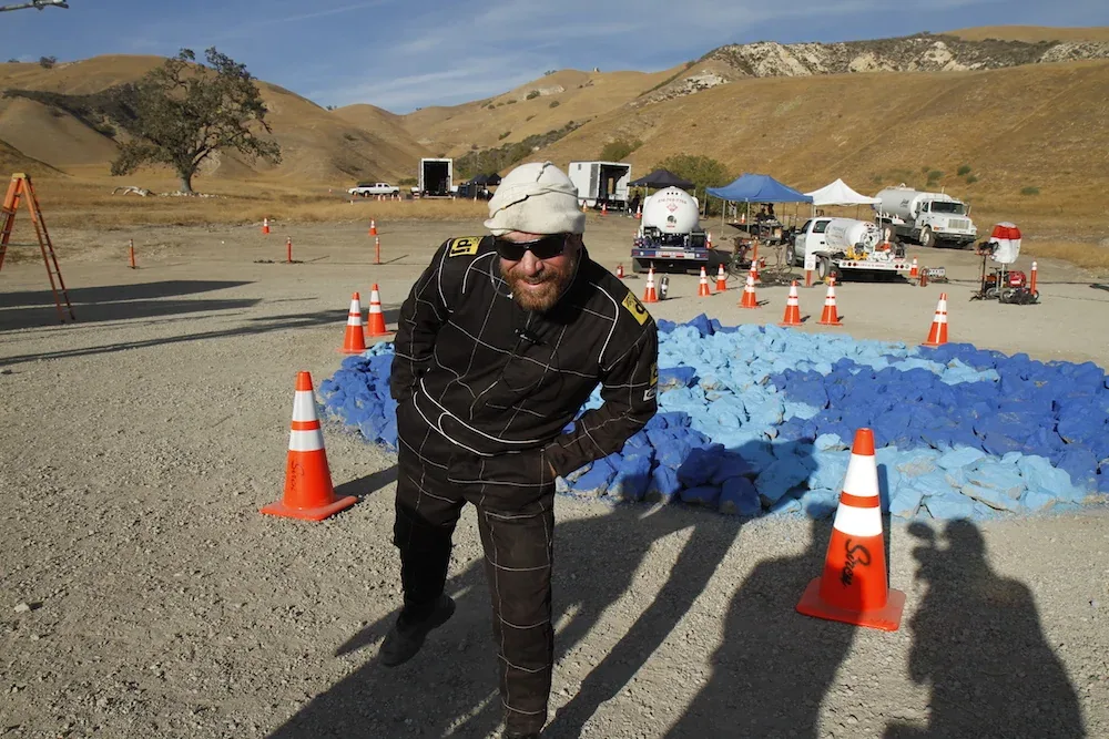
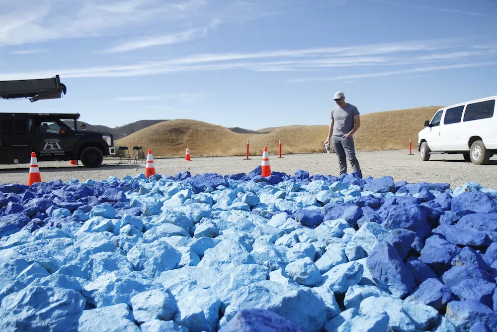
Production Designer Eric Archer and his cool, calm team made sure everything looked perfect, moving 20 tons of rock in the process.  

And Emilie Pereira made sure everyone looked good, styling their wardrobe inside that narrow niche between rugged outdoors and street chic.

Bringing the footage home, editor Terence Ziegler crafted an elegant and moving story while visual effects wizard, Vadim Turchin, turned his magic toward the final shot.

Beautifully graded at Nice Shoes by Lez Rudge and mixed by Joe Miuccio of Pure Sound, the final touch was added by longtime collaborator and composer James Morgan whose score takes the story to the next level.

I’m grateful to all of my team and pleased we were able to contribute a small part to the global story of communal minded folks who believe in net neutrality and the power of a collective.  Thanks everyone!

Small is Smart...

As with anything, it all started with an idea.  Actually, more like a Facebook post asking friends to think of “things that are small but have a huge impact.”  Armed with some examples -- some obvious, others obscure -- I invited my new friend and accomplished DoP, Jeff Bierman, to come out and play.  His champion answer was, of course, “YES!”

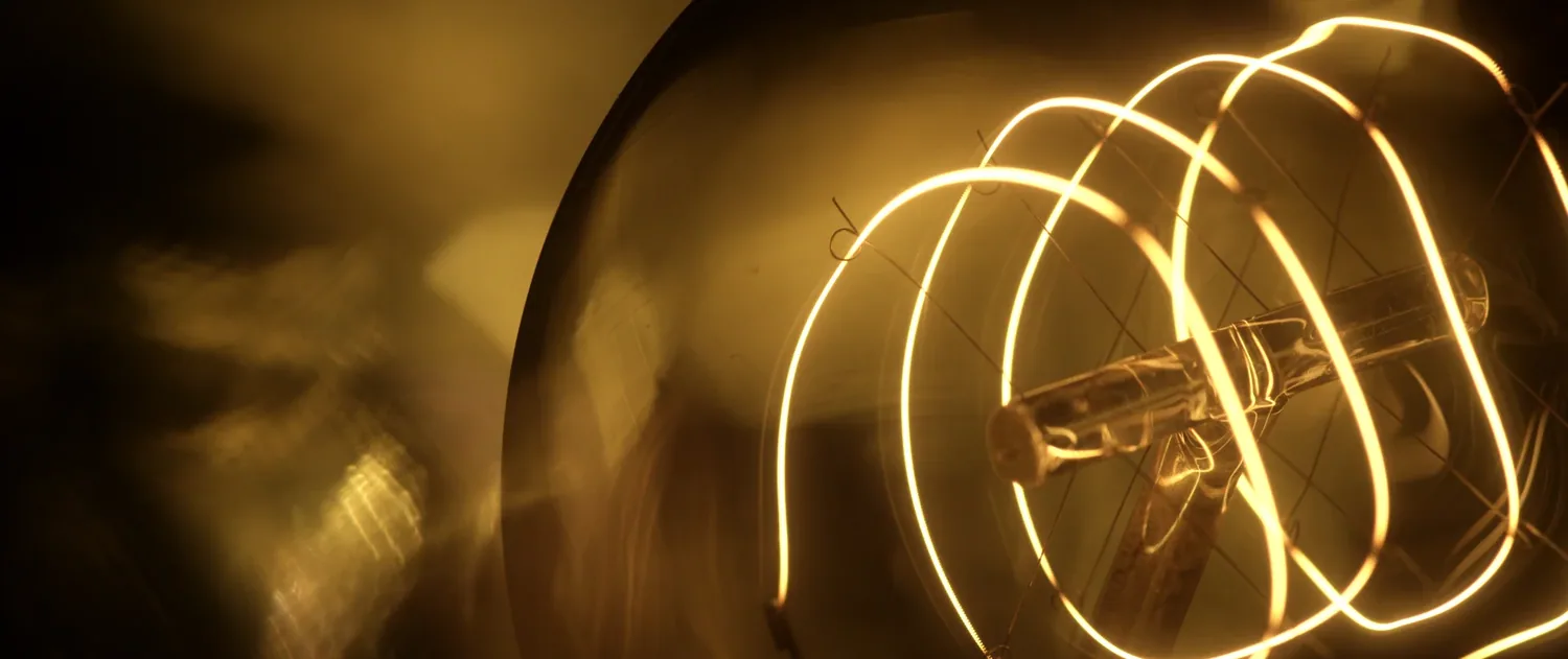
Together, we tooled around the City of Angels, capturing macro imagery of small-but-powerful things, culminating in the by-now-obvious reveal:  “Small is Smart”.

It brought me back to those carefree (long) days of scrappy productions where sweat and tears intermingle with hopes and fears to create an intoxicating mix of high expectations on low resources (and low blood sugar).

Once trusty collaborator Eric Wais and I were done, you’d never know it was shot for a dollar and a dream.

Solid thanks to Lenny Mastrandrea over at Nice Shoes for the excellent color, Joe Miuccio at Pure Sound for the smooth aural design and mix, Melissa Huffsmith-Roth for her “just right” vocal stylings, and my honey pie for her trim waistline.  Music by Sonny & the Sunsets.

I’m very proud of our final piece...

Service, Texas Style

Every so often, you get a client and an agency with the confidence to place their trust in a single vision.  In Dallas, Texas, I found exactly that.

We knew we wanted to portray moments of service.  Moments in a hospital that felt unique and intimate - not drawn from the healthcare commercial handbook.  To get these, we were given unusual freedom of access and subject matter which made all the difference.

I’m as proud of my collaborators as I am of the final piece and, though it was a tight schedule, we never had to compromise a shot.

Producer Meredith Witte pulls the MVP award for both shepherding the project through her agency as well as demanding the highest quality during post-production.  Without her belief and insistence, our crazy idea of using only sound effects for the “musical score” would never have gotten off the ground.  Nor would we have discovered the real Friday Night Lights!

Jeff Kim, as always, delivered sensitive, high quality images with a minimum of fuss and a maximum of skill.  I’m just glad none of us walked away with a haircut from the helicopter.

Keeping the train on the tracks was Shane Kalman, AD extraordinaire and staunch defender of zionist rights (the best AD is one with a gun).

And of course, pulling the whole thing together, was my producer, Stephanie Haberman, whose attention to detail, sensitivity to people and aesthetics, and genuine enthusiasm for “doing it right” have made her an indispensable partner.

Unexpectedly, this has become one of my favorite new pieces.  Thanks guys!

Don Julio Tequila

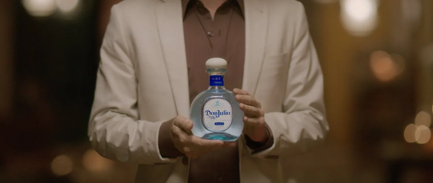
The greatest of swords are forged in the deepest of fires and, sometimes, the same can be said of films. This project for Don Julio Tequila wasn’t the easiest of productions but, emerging on the other side, it’s become one of the more satisfying.

Teaming again with cinematographer Jeff Kim, a master of light and shadow, editor Eric Wais, an impassioned advocate for pure narrative, and producer Jason Haymond, our level-headed, good natured ambassador, we were able to organically weave the idealized life story of the real Don Julio and his obsessive pursuit of the perfect premium tequila into an unusual film.

Shooting amongst fertile fields of blue agave and in repurposed mud brick barns, our production team succumbed to the magic (and the food) permeating Jalisco, Mexico, resulting in a piece that feels more cinematic than commercial, more passion than propaganda.

I learned that the best taco stands are the ones open until 3am and tequila distilled outside of Jalisco is simply called mezcal.

I learned that pipe tobacco is non-existent and the policia are admirably entrepreneurial.

And I learned that the indigenous peoples loved circles and that, sometimes, every so often, the best-laid plans really do yield the best results.

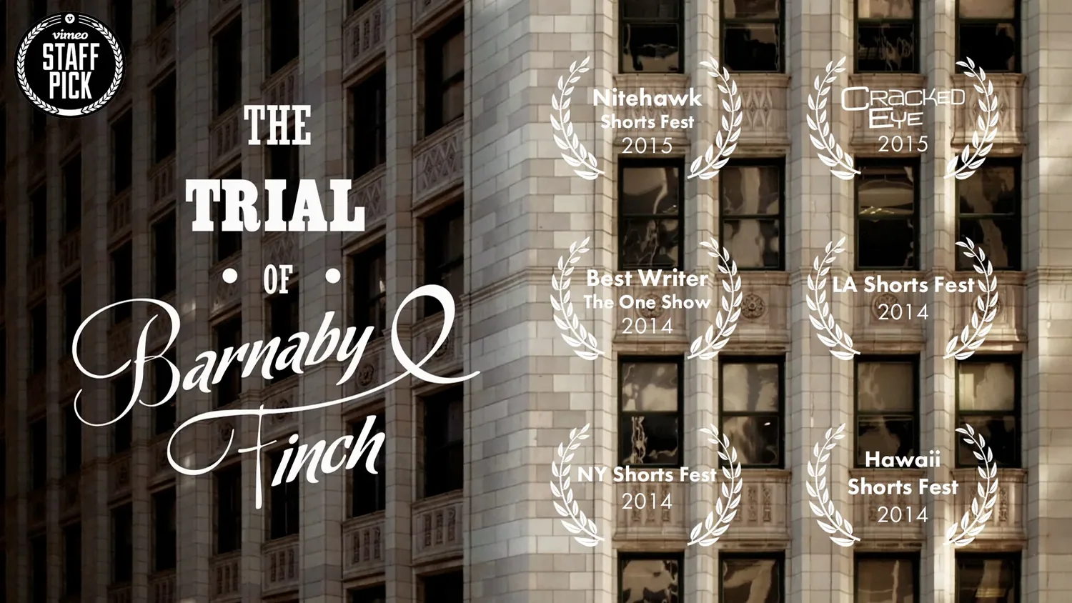
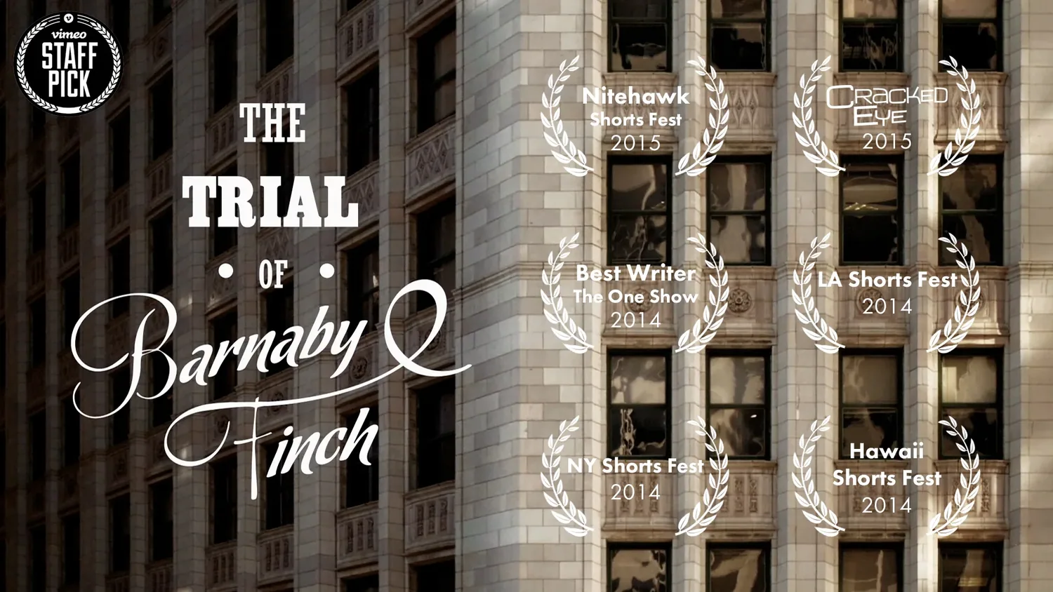
The Trial of Barnaby Finch

The most rewarding projects often have the most unusual origin stories.

Barnaby Finch is no different.

This short began as an exercise in “branded entertainment” at the Sundance Channel. Their idea was to give advertisers a unique taste of what they do best - original, independent cinema - by gifting them with a (very) loosely branded (or sponsored) film.

Enter humble (my production company/studio). The only guideline was to use a “split-screen” in the storytelling. Where to begin…?

I knew we needed to see the two potential life paths in parallel - if alternate - worlds, which meant they had to maintain temporal unity. Basically, we needed to stay in the same location. But how would that work - how could that work once an even mildly dramatic choice was made?

The solution: T. J. Jameson! The fast talking, hilariously arrogant blowhard interviewer grabs the narrative by the horns and guides us down the same hallways regardless of our hero’s choice. Whether an intern or the new vice-president, Barnaby was bound to be given a tour of his new office, letting the environment remain constant while the details escalated into increasing absurdity.

A narrative solution doubling as life metaphor - check!

As a new business model for humble, I took the unusual step of working with a co-director, Sam Stephens, whose background in visual effects gave us a foundation for some of the more inventive and surreal environments Barnaby would encounter. As an interlocutor, Sam brought a sensitivity to the storyline that helped refine and enhance the madcap pace we needed to hit in order to cram six pages into two minutes.

As engaged and supportive as Sundance was of the storyline and vision, their largesse didn’t extend to the budget, forcing us to make hard choices in an attempt to squeeze every last drop. Fortunately, we had the very thoughtful, artistic and calm cinematographer, Jeff Kim, on board as well as the skilled and experienced production designer, Elizabeth Jones, whose department worked into the wee hours turning lead into gold for each of our many environments.

Matt Campbell kept us on track while Christopher Marsh assumed the nearly suicidal role of line-producer. With only two weeks of prep over the Christmas holiday, we somehow managed to seamlessly pull it all together. (We were so frugal with out shot list that, by my informal count, there are only two angles not in the final cut).

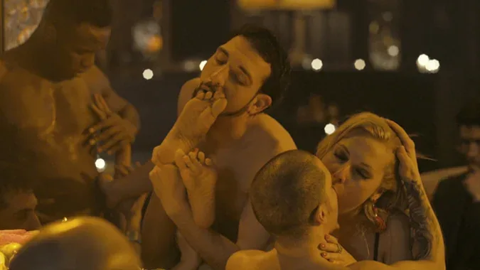
After painting actor’s bodies in black oil, watching Shiva groove to James Brown, and traipsing our excellent actors down hallway after hallway, it was all finally in the can. Which meant the real work was only beginning. Enter Megan Brennan, editor extraordinaire who’s cut some of my favorite work for years now. Slowly but deliberately, we slashed the edit to the two-minute mark, keeping the pace fast and tight. Frames mattered and we sweated each 24th of a second.

Too often music gets short shrift. Coming at the end of the process (literally one of the final stages of post-production) the money is usually all dried up. But a surreal, modern-day fairy tale like Barnaby Finch needed a theme and score to bring it alive. Fortunately for me, my good friend, composer and virtuoso pianist, Jim Morgan, offered to lend a hand. And I’m forever grateful. I can’t imagine this edit without Jim’s score anymore than I could imagine watching this story without the performances of Ben Roberts and Eoin O’Shea.

With extra finishing favors from The Mill and Sound Lounge and the tireless efforts of post supervisor, Sue Romweller, the piece was finally ready for air. Phew!!

As if this posting isn’t long enough, here’s a little behind-the-scenes video of the production process for those curious (or for my family who still isn’t sure what I do for a living). It’s a little heavy on “message” but still interesting...

P&G “Everyday Effect”

I really enjoyed making this one.

It started a number of months ago when my new friends over at the Grey Group came to me with a very thoughtful, anthemic P&G script. As (Creative Director) Denise O’Bleness explained, the idea was to focus not on any one household product but on the overall impact these “everyday” items have on the quality of people’s lives. They called it the “Everyday Effect” and wanted it to be beautiful, lyrical and real.

Some stock footage had already been sourced but when Denise began referencing Malick’s Tree of Life, I started salivating at the thought of creating equally lush, naturally beautiful images. Sorry, Terrance, we cribbed you!

Supported by Denise’s formidable agency producers, Todd Scheifele and Nina Roussarie, a plan began to coalesce. Together with my trusted line-producer, Jason Haymond, we assembled our team and honed in on our NJ based locations.

I was pleased to bring onboard the incredibly talented cinematographer, Andrij Parekh, who I’d been meaning to collaborate with ever since he shot my buddy John Krokidas’ short film, Slo-Mo, about a hundred years ago. Working with true anamorphic primes at 48fps on an Alexa, I was not disappointed.

The images were made even more beautiful with the help of our production designer, Tyndall Arrasmith, who went above and beyond to create the right look, going so far as to build a fake nursery to get those dormers “just so”.

After three days of shooting, we wrapped in the beautiful, if politically misguided, Woman’s National Republican Club where ethereal floor-to-ceiling windows silhouetted a touching scene of ballet mentorship.

The shoot was invigorating, the piece turned out beautifully and I’m grateful for my new friends. I’m a fortunate man.

NFL Hall of Famers

When the good folks over at Digitas asked me to tell the stories of 20 NFL Hall Of Famers for GMC, I was honored but didn’t have the heart to tell them I wasn’t a football guy and didn’t know any of their illustrious names.

Turns out, it didn’t matter.  All 20 Hall Of Famers were generous and friendly with their time, totally unfazed by their sports legend status.  They each told unaffected and personal stories of overcoming obstacles in their lives and I was moved time and time again.

My favorite story came from Steve Tasker - special teams hero for the Buffalo Bills.  Steve is well-beloved by many a football fan and, after hearing his eloquent, witty and riveting story, I began to understand why.

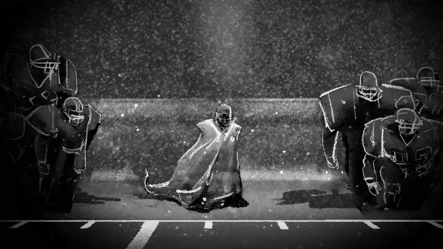
I worked on this series of films (slated to air as part of GMC’s “Never Say Never” campaign during the NFL season) with the expert editor, Gerald Zecker, the freakishly talented illustrator, Chris Mauch and the inventive and patient animator, Adrian Letechipia.  Post-producer Bridgette Spalding kept our little ship afloat as Anna Prebula and Marc Gottesman from Digitas kept us focused on the bigger picture.

By the end of our journey, I was transformed from an indifferent football philistine into a gridiron guru.  Alright, maybe not.  But at least I now know how to catch a long bomb (in the end zone).

live out loud

Living in NYC likely shelters me from the continuing difficulties LGBT people face in wider society: discrimination, ostracism, misunderstanding.  Especially for teenagers.

Which is why I was happy to participate in this series of PSA’s for Live Out Loud.  “The Homecoming Project” picks up where their previous effort, “It Gets Better,” leaves off, encouraging established members of the community to reach out and mentor LGBT teens.

Working again with the good folks at Deutsch (fearlessly led by Richard Kolopeaua and ably produced by Cheryl Masaitis), we cast real people whose coming out stories exemplified the courage and range of experiences of this community.

With cinematography phenom Alex Disenhof, art director Stockton Hall, and producer Dana Discordia, we shot quickly over one day in the Rudolph Steiner school on the UES, teasing out these four moving, personal stories.

The campaign was edited by Patrick Burns Jr. and colored at The Mill.

Fall In Love...

This poetic melodrama has an unlikely origin story.  It all started a year ago when I was approached by Robert Arnold, a young cinematographer in his last year of AFI.

“I like your work,” he said, “ and I need to build my reel.  If I pull together the production, will you direct a spec spot for me to shoot?  Do you have a script or any ideas?”

“Well, sure,” I said, “plenty.  How do you feel about opera?”

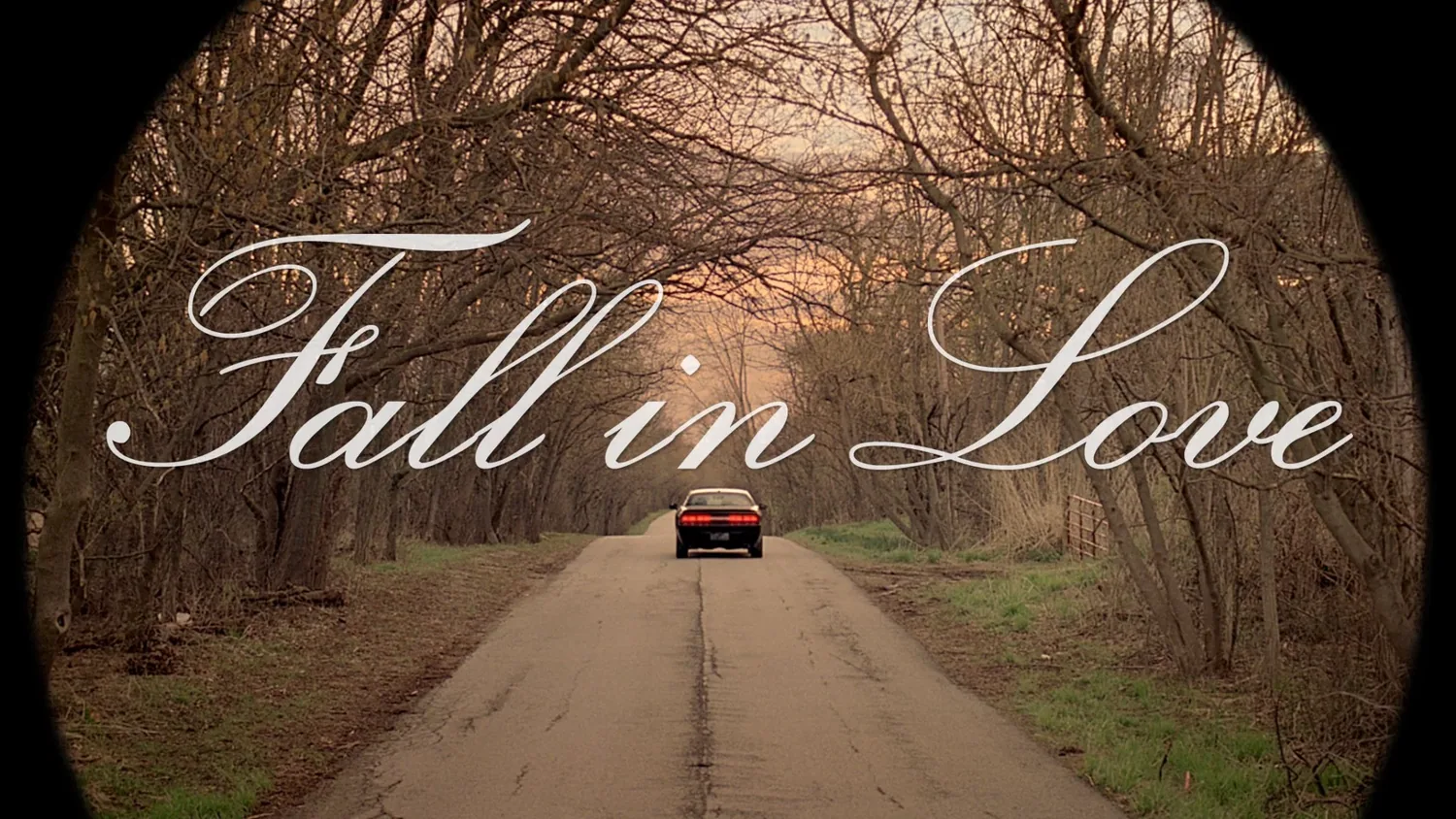
Robert wanted to shoot an auto spot but, knowing we’d never have the resources to shoot slick sheet-metal shots, I decided we’d best just tell a good story - with the car at the center.  I’d had an image in my head for a while of a couple arguing and furiously racing away in their car, all set to frantic opera music.

“Wouldn’t it be funny,” I thought to myself, “if we think he’s missing his girl but really, he just misses the car she took from him?”  Once committing to a more European style commercial, I hashed out the full story and we got to work.

Robert was as good as his word and, with the help of two young producers (Patrick Christl and Kathryn Henderson), they pulled together an impressive production in the suburbs of Chicago with just a buck and a dream.

Meanwhile, knowing how dependent on music this film would be, I researched operatic scores with director Courtney Selan to create this mashup of Verdi, Puccini and Tchaikovsky.

A few years back, my Scope spot won the Young Director Award at Cannes which came with a prize of 3000’ of 35mm Kodak film.  All that film had been burning a hole in my pocket ever since so I leapt at the change to shoot this no-budget spec on the best visual medium ever created (sorry digital).

After two days in the sun and rain, exposing the very last bit of daylight onto our very last roll of film and trying everyone’s patience and generosity in the process, we walked away with some beautiful footage.  But would it cut…?

Working nights and weekends with the patient and practiced editors, Vriana Bohling and Megan Brennan, we pieced together a fast-paced edit retaining the story’s odd, emotional core without any of the fat.  Expertly colored at Optimus in Chicago, the spot was polished off with a sound design by T. Terressa Tate and music mix by Jim Morgan.

Mizuno Mezamashii

It wasn’t until my second call with Mckinney’s superstar creative team, Will Dean and Robyn Gunn, that I realized this was a special project.

“What?” I said, thinking I’d heard them wrong.  “Did you just say you want this film to be ‘dark and arty’?”  What commercial agency talks like that?

“Yep,” they confirmed, “this is all about a feeling.”

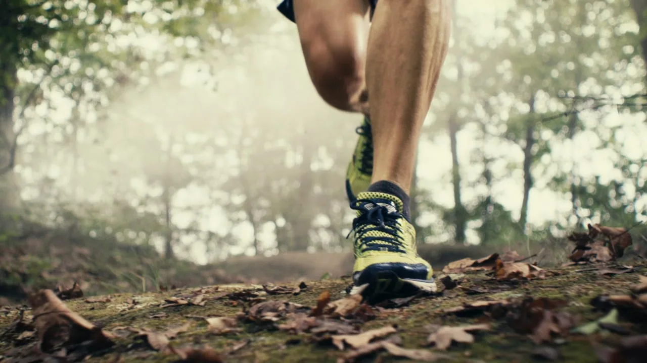
A month prior, the very talented DP, Thomas Scott Stanton and I designed a special running camera rig with Gary from Doggicam Systems.  Attached to the runner’s body, the rig extends the lens down and behind the runner’s feet resulting in dynamic, kinetic images of legs pumping through rapidly changing environments with the runner remaining frame-registered in the center.

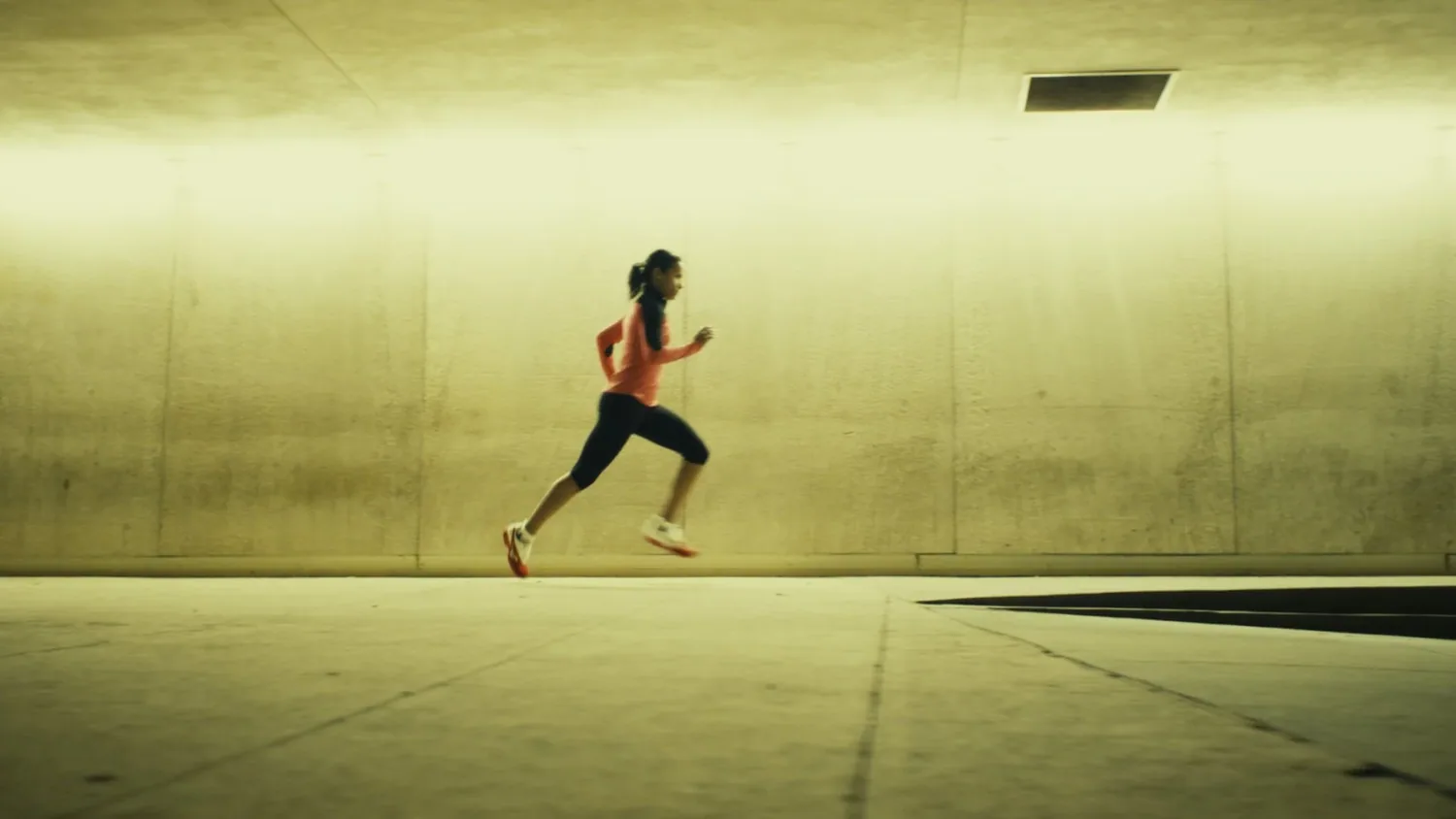
McKinney saw this unique footage and loved it.  Their goal for Mizuno’s first running commercial was to communicate the feeling of the “perfect run” - that euphoric, transcendent high when your legs feel they could run forever and your mind is in a deep state of calm focus.  They called this feeling “Mezamashi” and wanted to represent it in an innovative way.

“Dark and arty,” I said, “I can do that.”

So our humble team got to work, pulling together a crew to travel to Atlanta where we would capture this “dark and arty” film.  Starting with the eccentric and capable producer Janice Biggs and the up-and-coming cinematography star, Alex Disenhof, we rounded out our motley crew in the ATL with veteran AD, Kimberly Daniels (who I was thrilled to reunite with having successfully worked with her 4 years ago on my ASAS project).

Given the meditative, almost zen-like nature of the final piece, the overall composition had to live mostly in our minds while we shot, making clear collaboration critical.  Fortunately, Will and Robyn (ably facilitated by Naomi Newman and Brian Fox, the most enthusiastic agency producing team I’ve ever met) became real creative partners and true friends over the course of the project.

Though the days were grueling (including a midnight-oil table-top shoot in my hotel room at 4am), the footage made it all worthwhile.

Once home, I teamed with often opinionated and often right editor Eric Wais and was given the unprecedented luxury of time and trust to assemble our cut.  Combining our running footage with some candid interviews with Mizuno execs (who love to run), we also cut together a couple mini-docs to help explain the concept of “Mezamashii”.

love in the time of mechanical reproduction

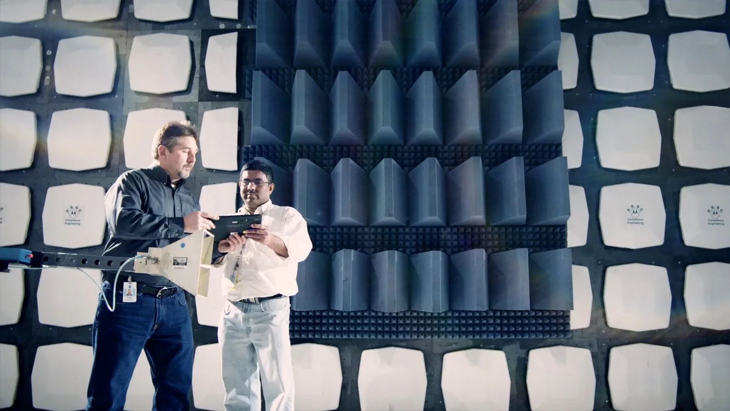
right before motorola launched their ipad killer, the “xoom” tablet, i partnered with their ad agency, ogilvy & mather, to make a documentary focusing on the “passion” and “process” of its creation. our team traveled to chicago, deep into the beating heart of the motorola empire, to interview key engineers, marketers and project managers as well as tour their state-of-the-art facilities and capture the magic of building a new piece of technology. i came away with two distinct lessons:

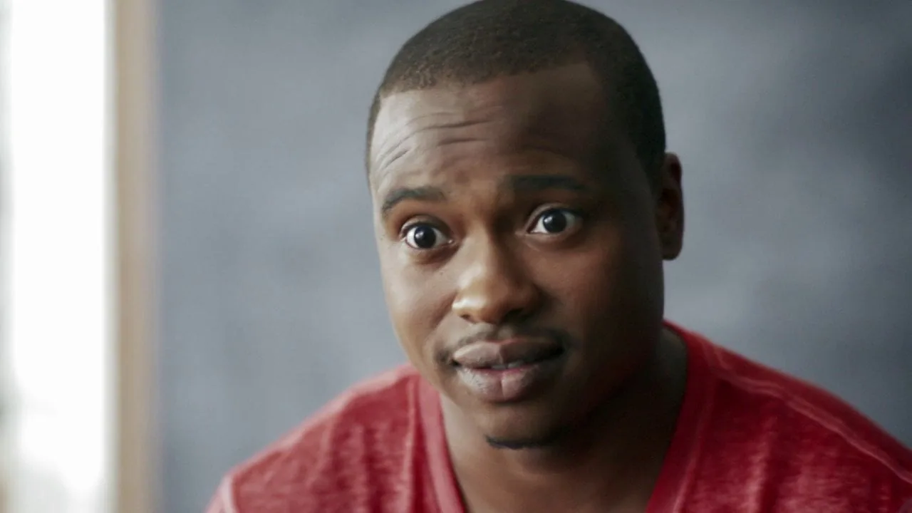
1) no matter how detail oriented or technical the job, passion lies firmly rooted in the eye of the beholder. this dude is psyched!

2) “state-of-the-art” technical facilities actually look like MacGyver’s messy garage. if anyone ever says you don’t need an art department to shoot a commercial because “you’re just getting documentary coverage”, simply smile politely and walk away. even a “verité” mess needs to be art directed.

after many hours with the hyper-thoughtful and extremely skilled editor, carlos almonte, and my favorite colorist, emery wells, we ended up with this short film which immediately disappeared into the ravenously content-hungry maw that is the advertising world.

but the more i started paying attention to the moto (and droid) campaigns, the more i started asking myself an odd question: are advertisers reflecting a cultural desire to be a robot?

the question might sound strange but consider two unrelated but recent campaigns:

i haven’t a clue what who this is supposed to appeal to. cyberpunk frat boys? disco-hopping sci-fi fans? is there a segment of people aspiring to robotic perfection? even if i don’t understand these, at least they’re still tongue-in-cheek fun, all about the par-TAAAAY!

the droid campaign is a different matter entirely. ok, so the iphone has effectively owned the clean, white humanistic design territory making the opposite direction - dark, mysterious and sexy - the obvious choice for a droid campaign. but just because apple has effectively conveyed an easy-to-use, distinctly human interface and tone, should droid emphasize a complicated and robotic aesthetic?

this is not metaphor. dude actually turns into the terminator (and let’s be honest, it’s definitely a dude). am i missing something? are there, in fact, large groups of people running around wishing to be Robocop? well, actually... hmmmm.

IKEA final final... finally

way back a year ago, when my friend lars asked if i wanted to help his creative team shoot test spots for an ikea pitch meeting, i had no idea what to expect. he pulled out a couple fresh-from-the-hopper scripts and asked me to come in for a conversation.  our last collaboration having been so fun, i thought: “why not?”  plus, my grandmother loves ikea so i thought it’d earn me a double share of cookies come christmas time.

(grandy’s cookies modeled by my super-cool neighbor and jewelry designer, lindsey).

the next morning, the conversation turned out to be not-exactly-but-very-much-like a pre-pro meeting so, needless to say, i brushed off my hangover and we hit the ground running.

while the production was one of those “you want what, when?!” type of deals, the creative written by mara evans and art directed by raul mandru was solid and charming.  the two storybook yarns (which would’ve felt very much at home on prairie home companion) valued narrative and tone over egregious product porn (sadly uncommon these days).

with my trusted cinematographer, aaron phillips, and an amazing new find, the energetic and innovative production designer, rachel macintosh, the production team moved mountains to get these films done (in the midst of a blizzard no less).

but it wasn’t until tim wilson at go robot and emery wells of katabatic (another incredible find) edited and timed the final pieces that the potential inherent in the original scripts finally emerged.

though we shot these a year ago, the final grading and finishing was only just completed last week.  i’m proud of the results…

oh, and ogilvy won the account.

cars in canada

landing back in alberta for yet another shoot, i figure i’d better hurry up and post my last canadian project or run the risk of lapping myself. but first a word on edmonton: despite the self-deprecatory, classically canadian habit of locals to refer to their city as “deadmonton”, i hereby rename it (shout out to uber-genius kristen) “golden threadmonton” because of the strangely diverse and interesting projects and people i’ve come across up here.

not to mention the proliferation of CASH, MONEY…. hmmm, what comes next?  oh, right, HO’S.

from hospitals to oil changes to teacher’s unions to pharmacies, i’ve worked on a wide range of challenging projects.  there are obvious limitations to a regional market but one advantage is the freedom (and sometimes necessity) to wear multiple creative hats.   unlike what i’m used to down in the states, in Golden Threadmonton one doesn’t have to be strictly a “____ ___” to shoot with “____” (fill in the blanks: “car guy” - “cars”; “performance guy” - “actors”; “comedy guy” - “funny scripts”).

as one might suspect, this is quite refreshing.

what’s also refreshing is the unassuming attitude of the many fascinating and intelligent people who’ve made their lives in the cold Albertan north.  from geneticists to music promoters to video artists to photographers, I’ve found an unexpected underground scene brimming with creativity, energy and possibility.

as proof, just look at this mural inside a local fast food restaurant - yogi bear with a 1960’s playboy bunny?  what the…?!?!  what do they put in those burgers?

anyway, about a month ago i had the pleasure of collaborating with the hugely talented DP, chris walters, on a commercial for Integra Tires.

while the spot doesn’t pretend to reinvent the formula for selling tires (es cuáles es), i’m proud of the work we were able to do.  i always feel that every project, regardless of its constraints, offers some area worthy of intense focus to excel at and learn from.  this time around, it was the chance to light and shoot large, curved mirrors: cars.

here’s the final spot - the red-burst backgrounds a last-minute inspiration from shooting on (the completely useless) valentine’s day.

alberta teacher’s association

a few months back, i had the opportunity to experience a “not-freezing-your-ass-off” canadian summer.  it was beautiful with lush, colorful foliage, mild sunny days and the feeling that, for a moment at least, all could be right with the world.

pithy though my travel writing might be, i was there to work and the project (for the alberta’s teacher association) was encompassing.  teaming up with my favorite canadian ex-pat DP, christopher walters (pictured here under extreme suspicion by the TSA), we populated an elementary school with adult students playing at being 3rd graders.  the agency’s idea being that if schools don’t pay attention to kids when they’re kids, society will have to deal with much graver consequences when they’re adults.

strapped for cash, we shot on the canon 5D and the result is pretty decent.  that said, the camera’s handling of color still seems a bit sketchy and, as the files are already so highly compressed, there’s not as much range in post to correct any chroma-shifts.  even so, my not-so-secret find of the year, emery wells of katabatic, did a great job grading the final piece.

though the day was grueling (a dozen actors playing children are not unlike a dozen children play acting), i felt the shoot came off well until i spied a doodle by one of the actors no doubt sketched during the many breaks for lighting or camera resets.  i think i’m the angry looking guy:

here’s the final spot:

Ice Water Cometh: a truly inconsequential meditation on the history of ice water in hospitality

I’ve often wondered at the ubiquity of ice cold water in hospitality.  Certainly there are times when an ice cold beverage is the longed-for refreshment - after a sweaty day (or night) of hot labor or during those 2 months of brutally humid heat in the dead of a NYC summer - but mostly, ice water just makes my hands cold, my fillings hurt and my head ache. Surely many others have noticed the incongruity of being served a glass of ice water by a well-meaning server in the middle of winter.  The rule of thumb seemingly should be: “if you have to heat the room, don’t ice the water.”

Besides the discomfort of relative temperature extremes, there appears to be a health reason to avoid iced water as well.  Something about a shock to your system and a digestive inhibitor.

Pondering these deep questions while being served iced water in the middle of winter on a heated bus, I began to formulate a theory.  Like the great philosopher-scientists of old (Plato, Aristotle, Empedocles) who disdained experimental observation as coarse and unseemly in contrast to pure theoretical poppycock (aether, anyone?), I am content to propound an explanation based on zero historical fact or responsible research.  Even so, I’ve a hunch I’m right.

My theory is that somewhere in recent cultural memory, ice water symbolized luxury.  Today, ice water is virtually worthless but not long ago, before the advent of refrigeration, if I offered you ice water, what I was really saying was that I had laboriously harvested a big block of river ice in the winter and carefully kept it insulated in my cellar with straw and blankets so that, 6 months later, I could chip off a piece and put it in your drink.  Or, more precisely, I was saying I could afford to hire someone to do that.

In a warm climate, as Paul Theroux’s Allie Fox tragically demonstrates in The Mosquito Coast (forget the movie, read the book), ice is nothing short of a miracle.  A truth I discovered empirically, if imperfectly, at the age of 8 when I had the foresight to secretly stash a winter snowball in the freezer to be used in the heat of summer as the neighborhood’s only operational winter weapon against my unsuspecting sister, Star.  A most cunning and devious plan which I either did or did not get from Calvin & Hobbes which began syndication around the same time.  To this day, I don’t know whether it was the months of building anticipation and excitement that over-adrenalized my arm or the strangely tender feelings I had developed for this hunk of anachronistic snow that perverted my aim but, either way, I missed.  As I looked on, dumbfounded, my sister calmly and carefully scooped up the scattered snowy remains quickly melting on the hot asphalt and returned fire.  She did not miss.  Needless to say, I was disappointed.

With this kind of labor in mind, a restaurant of yesteryear serving iced water in the summertime must’ve seemed impossibly lavish - an oasis in the desert.  Thus the unconscious shorthand employed by your waiter every time your glass is filled with clinking, freezing ice cubes.

But times change and, like many antiquated notions and ideas (the electoral college, landlines, television commercials), ice ain’t what it used to be.  Perhaps, as we all tighten our belts in this age of the “new normal”, it’s time we leave ice on the side and slake our thirst with lukewarm tap from now on?

Abstraction in Data

while sorting through my visual archive, i ran across an abstract color scheme that came about near by accident... after my computer and camera were stolen last year, i attempted to retrieve some of the lost work from secondary storage systems - some of which had already been written over. consequently, the basic structure of this image was generated by a data rescue program attempting to reassemble information from a corrupted photoshop file.  after some additional tweaking, i ended up with this:

unintentional beauty.  in this case, function IS the form.

presumably a viewer attuned to a different kind of visual language would be able to “see” in this data stream a portion of the original image which, by now, i’ve long forgotten.

what’s even more arresting is the level of detail inside the image.  i’ve posted cropped views here to show the various bits of colored data.

hello world!

well, this is it. my very first post on my brand new, wet-behind-the-ears site... for about 7 years i’ve had a basic website with a selection of my work built in dreamweaver with photoshop slices. pretty simple stuff. i rarely updated it and certainly never used it as tool for discussion.

enter patricia ackerman and joshua “red” russak. joshua, an enterprising wordpress developer, contacted me after seeing some of my work and offered to help me update my online portfolio (he explains it well here). agreeing, i approached patricia, an amazingly thoughtful and intuitive interactive designer, and the three of us got to work. i couldn’t be more pleased with the result - thank you guys!

but as exciting as a new site with 2.0 functionality is, as those who know me know well, i’ve viewed the “broadcasting” of oneself with trepidation in times past. what’s changed, you ask?

well, in a sense, not much. i don’t plan to use this space as a diary and i don’t plan to reveal every last detail of my private life to the spider-bots endlessly crawling the web. i intend this space to be a record of my work, for both love and money, as well as a curated selection of observations that others might find interesting. (that’s you, mom)

but one thing did change: for as long as i can remember i have defined “art” as that which somehow engages the world in conversation and an “artist” as someone engaged in a dialogue through their work. often, this is a dialogue on the human condition or the nature of beauty but it’s the conversation that matters more than the content. believing that and recognizing the exploding potential of genuine conversations - not just trivial chatter or marketing nonsense - growing around social media tools, it seemed time to engage.

i smile as i write this realizing how many similar posts must exist at the head of every newbie’s blog hatched onto the inter-webs. someone explaining, to no one in particular, why and how they came to first tack their thoughts onto the global bulletin board. someone with better coding acumen than i should write a program to collect the first blog entry of every blog and curate them into an online exhibit (i think that’s you twhid!). that would be an interesting online art project...

and so it begins... feel free to sign up at the right or check back from time to time to see what i’ve been doing or thinking. i’ll do my best to be succinct, genuine and useful.

thanks... sorrel